New King Crimson Film by Toby Amies
Reply
Her work was recently Featured on NPR:

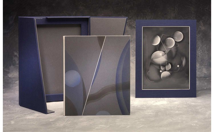
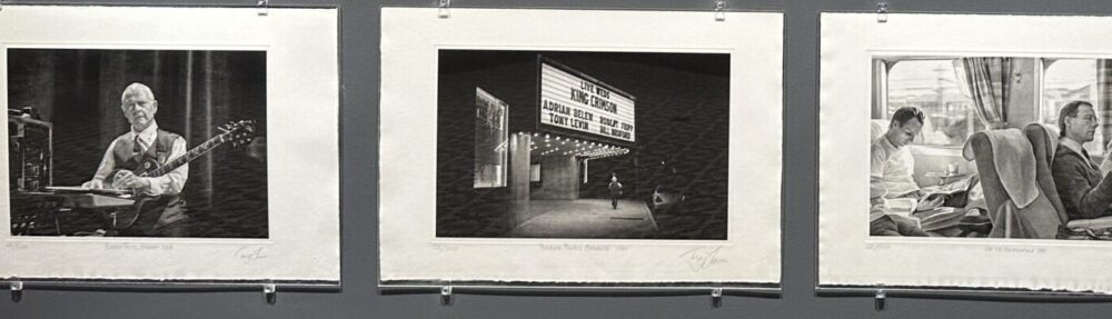
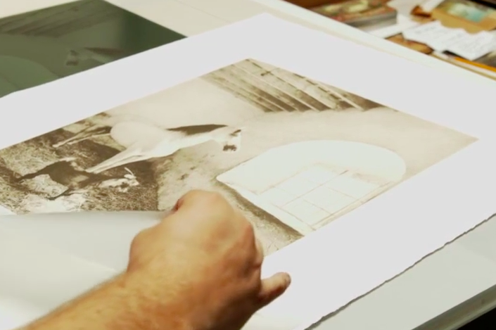
Tony Levin has a new collection of prints made in collaboration with Jon Lybrook, lead printmaker at Intaglio Editions:
Bass Legend and Photographer Tony Levin’s King Crimson Print Collection Available for Pre-Orders, Shipping Early 2022
ASHEVILLE, NC, USA, November 12, 2021 — • Eight stunning, limited-edition prints spanning Tony Levin’s work with King Crimson since the early 1980s
• Every print is signed, numbered, and certified by Intaglio Editions LLC
• Prints are made by contemporary photogravure printmaker, Jon Lybrook
• Available as individual prints or in a limited-edition, custom-crafted clamshell print collection box
• The first public orders are assigned print numbers 11-50 out of 500 prints total in each edition
• Pre-orders are now being accepted at TonyLevinPrints.com
I have been on something of a hiatus from my own artwork while developing my businesses in polymer photogravure printmaking, web software development and video social media marketing. I hear about artists taking extended breaks from art to work on life issues and it seems I reached that point some time ago and never realized it.
Whether improving artistic skills or developing a business, the approach is the same. Set a course with a destination in mind, but see where it leads. How you get there fundamentally involves what you know, and how well you pay attention.
Printmaking is all about paying attention.
Whether we are focusing it for the pay, personal work, or pleasure, the quality of our attention is our single-most important and unique gift. Our quality of attention reflects our essence, showing what we know, what we value, and who we are.
Why do some people make $20 per hour and others make $20,000 per hour? One could argue it was the quality of their attention is the only difference. In the real world people command top dollar for who they know as much as what they know in some cases. The power to get and hold people’s attention is the power to do anything, in effect.
In this internet-savvy world of automated processing of communication, having an individual with experience who will listen to you and provide their perspective is becoming more rare. Face-to-face attention still desired over all other forms of communication when the stakes are high. It is the very reason the airline industry is still in business.
What makes it really great is when you are such an expert at what you do and so well-respected that others want to give their best back to you in return all the time. If attention is the currency, respect is the end-product.
So in that respect, I thank you for your attention!
Jon Lybrook, April 24, 2017.
Jon Lybrook demonstrates photogravure printmaking techniques
This project is to help you begin to incorporate any new printmaking techniques that I demonstrate in the printmaking techniques video to see if you can improve the number of tones and richness you are currently getting in your prints. The assignment is to make 10 unique prints from the same plate, making slight changes to each, analyze what worked, what didn’t and why, and report back to the class on your findings.
Getting solid, repeatable results is the goal of most people involved in printmaking. An incredible amount of time and resources go into fine handmade printmaking, so anywhere time and resources can be saved means more time and money that can be spent toward other work or endeavors!
Printmaking is as much of a science as it is an art or a craft. And, as noted by management thinker Peter Drucker, “You can’t manage what you can’t measure.” Being able to observe the effect of something and understand its level of significance, as well as its cause, is central to being able to improve any process. Printmaking is no exception. By documenting your inking and wiping changes you can repeat your successes.
Apply one of the new techniques shown in the class video to your workflow with each new print, and take physical or electronic notes about your changes, your expected results and your actual results to the outcome in a diary. Your print diary should include extensive details about what was changed in each iteration including:
After critiquing all your prints submit your three favorite from among your ten. Compare and contrast them in your journal post. Also note where there is room for greater improvement or perhaps areas where you may have lost some fidelity by doing something differently. Perhaps a certain wiping technique improves your contrast but loses highlight details. Printmaking is an ongoing, but increasingly effective, cycle of wins and losses.

Intaglio Press
There are hundreds of ways to affect a print during the proofing, as every printmaker knows. You can change the paper you are using – going from something like a cotton Rives BFK 300 gram paper to Kitakata, a 33 g/m2 Japanese kozo will produce a dramatic shift. Not just in tone and color, but in sharpness, clarity, and added depth.
Subtle differences can be achieved through the use of ink modifiers, such as 00 burnt plate oil, EZ-Wipe or by using different colored inks or mixing them in various proportions. Often times you can open up shadow details by cutting the ink with a little bit of 00 grade burnt plate oil. You can also experiment by intentionally leaving more ink in certain areas of the plate, or less. Carefully document what you did and your results and post that to the class as well. Your assignment, again, is to make 10 variations on a print changing only the ink, how you are wiping the plate, or the paper used and post your 3, favorite with comments.
Here’s a breakdown of each of our steps along with variations you could try when making your ten initial prints. Write down your observations about how subtle changes in your execution affect the final print.
Part 1: Preparing the Plate
Sanding the plate is critical for safety. Here are some aesthetic considerations/variations:

Photogravure plate from polymer
Part 2: Mixing the Ink
Here is where you will have the greatest number of choices in how to ink your prints. By experimenting with different inks and modifiers you can adjust contrast, density and translucency in your prints.
Part 3: Brayering and Wiping the Plate
Brayering is simply to get ink onto the surface of the plate without scratching it. In wiping the plate, we push ink into the pits embedded in the plate, creating a richer image. One aspect of intaglio printing is that ink can remain both on the surface of the plate, and recessed into the plate. This causes the ink to be embedded both in and on the paper. Some things you can do during this stage of the process to affect the results:
Part 4: Wiping the Edges
Cleanly wiped edges are generally considered best practice and good form in traditional printmaking, so in this lesson I show you how to do it effectively. This is not to say it could not be used creatively, so maybe try these variations:
The first couple of prints one makes are not usually that stellar. As I say in the video, polymer plates must be printed two or three times before the plate becomes seasoned and starts printing more uniformly.

Printmaking Techniques
Part 5: Preparing the Paper
There is a lot to be said on the subject of paper in printmaking, far more than the scope of this tutorial will allow me to cover. That said, you should be familiar with how to print on various kinds of printmaking paper. Printmaking paper is specially crafted to hold up to water and pressure required to make intaglio prints in the traditional manner. Generally speaking, heavily textured paper tends to break up the continuous tone of the image and introduce paper inclusions randomly throughout the print. This may or may not be desirable, and using different kinds of paper can affect your print dramatically.
Polymer Photogravure Print: “The Inseparable” by David Brookover
Part 6 : Making the Print
Just as there are hundreds of papers to choose from, there are many different ways to work the press. The functional act of setting the pressure and running the press is a technical knowledge that’s required to control the process. Once control is gained, the knowledge can be used to make creative decisions to experiment beyond your established workflow as a conscious choice – not settle for something that looks kind of interesting rather than really good, because you can’t control the process!
Santa Fe printmaking artist Ron Pokrasso likes to work by continually adjusting and running the print through the press multiple times, keeping it trapped under the roller to aid in registration. By strategically adding layers to the piece each time it goes through the press (and employing techniques such as monotype, multiple plates, a la poupee, chin colle, and post-press techniques such as watercoloring) Ron and his students are able to build upon a composition by thoughtfully adding or taking away from the piece as needed. This is just one example of the many different ways the press can be used to enhance your work. Through continuous work, study and experimentation you will expand your repertoire in ways to express yourself visually through printmaking.
The goal here is to create something unique, and establish a process you can repeat again in the future. Once added to your art arsenal, as it were, and you have mastered it, you should then stray from it to create something hopefully original and beautiful.
To watch the full video click here! Please post your questions and observations and I will respond in kind!
Write me with any questions and I look forward to seeing your work and findings.
–Jon Lybrook – May 2015
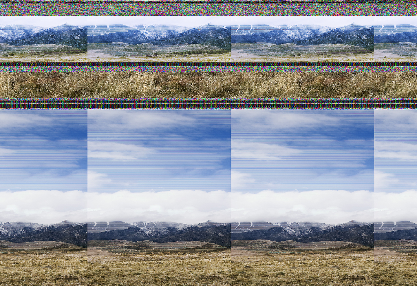
Angela Faris Belt is a fine art photographer, author and educator who engages other artists involved in creative photography with her writing. For her own photography, Angela uses a wide range of media to create conceptual images. I had the opportunity to chat with Angela about her series “Entropy”, which started as the result of having to salvage her work from a computer crash. The crash caused the scrambling a large number of her original digital photographs permanently, which she then proceeded to examine and curate for use in a show.
In a quick interview below, Angela answers eight questions about this series and her work in general. The work is currently on display starting tonight at the Dairy Center for the Arts in Boulder, Colorado and runs through August 2015.
Grassland Ends by Angela Faris Belt
Your “Entropy” series seems on the surface to be the glorification of, and finding the beauty in, the results of the critical malfunctioning of a system storing your raw vision. Is that how you’d describe it?
AFB: In many respects that’s right. My file system crashed while I was uploading images from a trip to the Great Sand Dunes. My hard drive was backed up, but that shoot was very important to me so I ran a recovery program to save it. Obviously the results weren’t as I’d hoped, and my first response was abject horror. But scrolling through the “recovered” files I realized something really unique and beautiful was happening, some kind of new landscapes that combined my own vision of the land with the digital language used to express it.
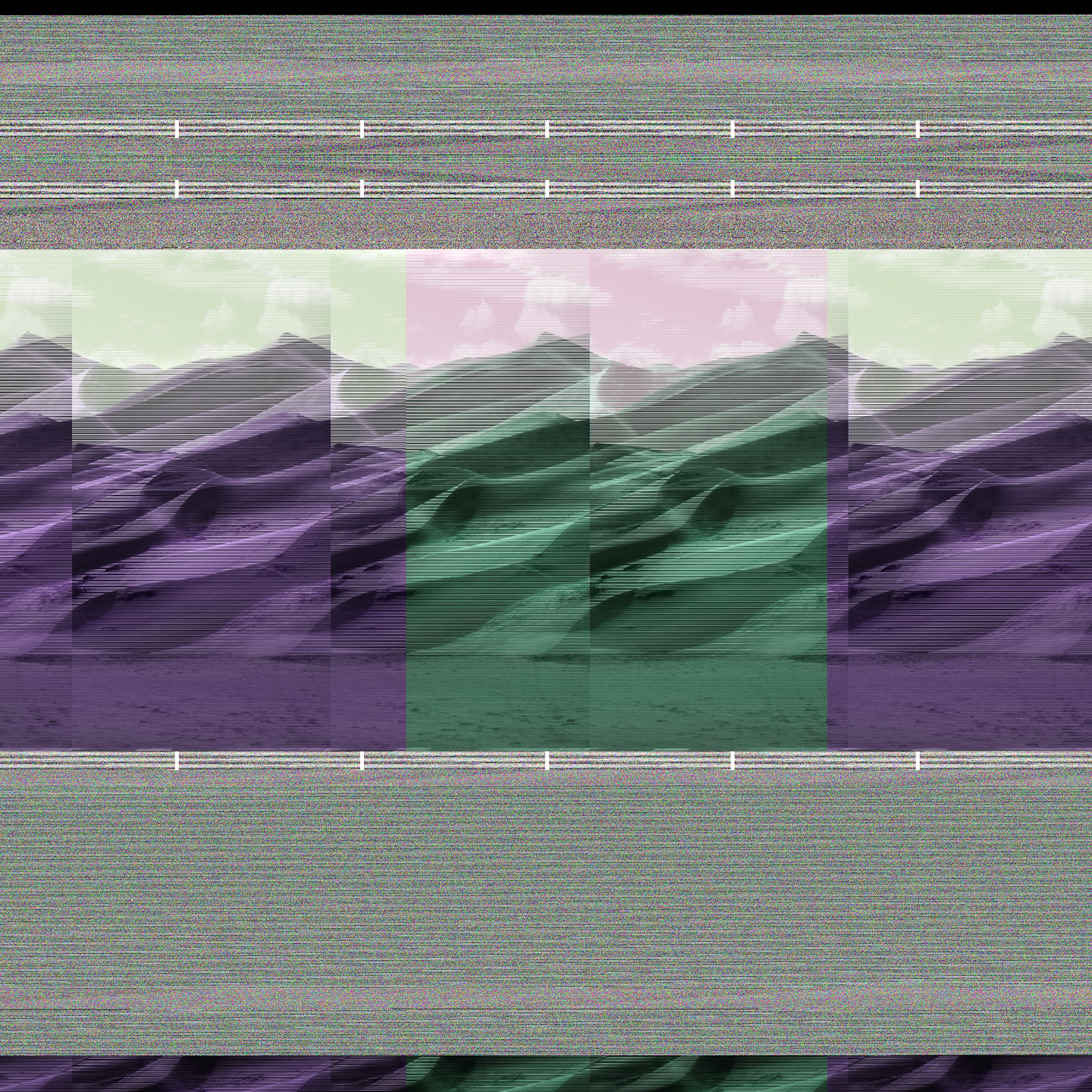
Dunes by Angela Faris Belt
You’ve battled cancer and resulting physical difficulties for many years. Would you say this series is related to your body’s own malfunction and subsequent recovery?
AFB: Wow, that’s the first time anyone’s made that connection. In fact I hadn’t even made it, so it definitely wasn’t conscious. But I do believe if you look closely at any artist’s work you’ll find parallels between its themes and the artist’s life experience. Our experiences form who we are; they influence our interests and guide our endeavors, so I think there is always an innate connection. In this case, disparate aspects of my life that I keep in discrete spaces on my hard drive became intermingled—my research and conceptual landscape images, contact sheets, demo images I use in teaching, and even personal snapshots and medical images like MRI’s and CT scans I’d saved. So the connection you mention between bodily and computer malfunction does emerge in several of the images, especially in the contact-sheet-looking images where the “inner workings” of a physical self juxtapose with the landscape.
Philosophically, I don’t really see the malfunction of a system (whether physical or digital) as wholly negative though; it’s part of the nature of things, and as such it helps to define the system of which it’s a part. Things we typically perceive as “mal-functioning” are at the same time “functioning” on some other level—even when we don’t like or understand it. That’s part of what worked for me in the recovered files.
Many of the pieces you selected seem to be of nature, but fragmented with repeating geometry characteristic of the digital world: static noise patterns, bifurcating triangles, and long horizontal lines segmenting your images and fractured iterations of your original photographs. What purpose does repetition of form serve in this series and art in general?
AFB: A vast majority of the recovered files were a cacophony of static or repeated patterns with nothing else going on—no meaningful content whatsoever. But when that randomized data was interspersed with some recognizable content, the result offered up a bizarre sort of symmetry that held potential meaning. The repeated and mirrored content in many of the images made me think about how so many of our images of nature are variations on a theme. That is, if we follow a formula for making a good picture of, say, a waterfall, we can then make a good picture of any waterfall. In that way these images are essentially interchangeable. Almost anyone can envision it, because you’ve seen it a thousand times: cascading water + pristine land on each side + camera on a tripod + long shutter speed = pretty waterfall picture. The formula developed because it works to meet our expectations—our ideal of how a waterfall should look. But those pictures usually have nothing to do with the specific waterfall imaged, which further underscores our homogenized beliefs about waterfalls (or any type of landscape image).
Some of the images resemble contact sheets often used to proof a series of photos back when we shot film instead of digital. In spite of the avant-garde/techno feel of some of these images, there is a definite sense of your experience in traditional photography and attention to detail as well. What do you believe some of these compositions you’ve chosen from your recovered hard drive say about your relationship to photography as a whole?
AFB: I’m part of the last generation of “born and bred” darkroom photographers who in graduate school began staring down the barrel of the digital photography age, and I for one wasn’t about to go willingly. During a conversation about it, my mentor, artist Joseph Grigely said, “Artists can’t be dependent on any particular medium or technology to make art.” I always remembered that, even though I thought I’d never adopt digital media. But years later as issues with my health developed, spending hours amidst darkroom chemistry aggravated them, and that sort-of forced my hand. So one day I got up, sold all of my camera and darkroom equipment, bought a digital camera and Photoshop, and never looked back.
I do think the influence of traditional darkroom practices is present many of these images, because that’s the tradition I came from and many of my digital working methods are a holdover. I champion the necessity of contact sheets, as my students can attest (or should I say protest). They allow us to look at the cumulative result of our work in a comparative space, to spend time going back and forth among several images. So even though I work digitally I still print contact sheets of my best images to use as an editing tool, and some of the images in Entropy that I found most interesting contain some of those elements—text, evenly spaced similar images, etc. In those images things that were once tangential—like file names and the variety of images on a single page—took on meaning. When you look at contact sheets you don’t think of them in terms of cumulative meaning…they’re just the best means of spending time with one’s work and deciphering what works within the context of all the images made.
I like the fact that even if the medium an artist uses isn’t intended to contribute to the work’s meaning, traces of it are always there. These contact-sheet-style images bring different aspects of that to the forefront. I intentionally chose files where the images they contained suggested meanings that would otherwise never be alluded to when seen in isolation or when viewing them as a contact sheet in the editing process.
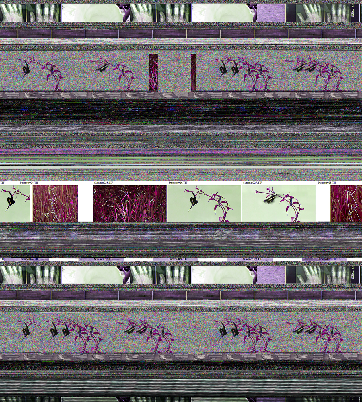
X-Ray and Butterfly by Angela Faris Belt
You started this project with the goal of salvaging your work, but eventually gave in to accepting the random changes the recovery program and/or data corruption introduced. This formed a new context for your decision-making, and one could only assume, changed which images you chose to present. Some might call this the result of “happy accidents” or gifts from the universe. Is that how you see it?
AFB: Well, the crash didn’t prevent me from printing and exhibiting any of my fine art images, since everything was backed up (with the exception of the Great Sand Dunes shoot, which only exists sporadically throughout Entropy). But the recovery program opened a window for the “ghost in the machine” to show itself, I responded to that. The whole thing reflects the lack of control we have over even the things we perceive as foregone conclusions. I suppose another bright side is that it allowed me to introduce some pretty landscape snapshots (my photographic guilty pleasure) because they were re-contextualized in conceptually interesting ways.
I love things like that—serendipity, happy accidents, random acts of kindness, and gifts from the Universe. Nature writer Annie Dillard says, “Beauty and grace are performed whether or not we will or sense them. The least we can do is try to be there.” Gifts are different than expectations. I like to think of the universe as showering us with gifts; they’re just hard to recognize when we’re so busy trying to open an umbrella! As I looked through the files I recognized literally each one of my photographs (and some from artist tear sheets and students’ projects, which I deliberately omitted), and I just had to let go of what I had intended for some of them and welcome the breadth and depth of new meaning derived from the resulting images.
Has having to evaluate your original photographs transmogrified by a random technical failure changed how you photograph subjects now? If so, how?
AFB: Oddly, no, but I think it’s because my work is always based on seeing something that’s already there, and translating it (using photographic language) for others to see and understand. In this case it’s changed my approach to making art in a broader sense by allowing me to examine the possibilities of using digital media itself to infuse meaning into the images. In the past I used historic/alternative photographic processes in my work, but when I switched to digital media I became rather photo-centric, meaning that I concentrated on the image as a singular construct. Now I’m beginning to experiment with layering images, and using Photoshop as a linguistic tool much as I would have used historic/alternative darkroom processes to add a “material” depth of meaning to the images. Nothing has come of this yet; I’m just experimenting with the tools.
The composition of photographs represents the state of mind of the photographer in many respects. Do the images you have chosen represent a mental state in general, or are they more of an intellectual statement than a visceral one?
AFB: For me art is always a balance of both; if it’s visceral enough it sparks something in my intellect as well. I sat this entire folder of recovered files aside for several years; I knew there was something there, but the timing wasn’t right because I was working on other things. But all the while the images were affecting me, because I never forgot them. I think I needed to wait until I found space to “edit from” rather then “create” new images in order to make good decisions about these files, and to cull an appropriate representation of images from the tens of thousands. I found hundreds of images that were visually lovely but had nothing to offer in terms of broadening or deepening the concepts emerging in the work, and I found hundreds of conceptually fascinating images that were a visual cacophony; both kinds of images were omitted from final body of work. It’s how I relate to any art. Take music for instance: if I heard about a new innovative kind of music, but it sounds atrocious, then I’d have a hard time caring what it might have to offer intellectually or to the world of music in general.
Falling Rock by Angela Faris Belt
What would you like people to take away from this series of work?
AFB: For a time I lived just off the Blue Ridge Parkway in the North Carolina mountains. It was one of the most beautiful landscapes one could hope to live in, and I had a very nice neighbor not far away. Driving home early one particularly beautiful morning I saw her outside and I exclaimed, “Did you see that glorious sunrise?!” She responded, “Oh, you get used to it.” At that moment, I had heartfelt sympathy for her, and since then I realized that most of us grow numb even to the most spectacular landscape or natural event. We allow our perceptions to become too blunt to see the sublime in the familiar. It’s a shame, really, since the beauty we most often encounter is entwined in our everyday experience. Since that time I’ve referred to that kind of thinking as a kind of “poverty of spirit” that I consciously work never to succumb to.
I suppose I’d like people to think about the images they see, and to allow them to deepen their perceptions of their “everyday” landscape. I’d like people to recognize that the natural world is comprised of uniqueness rather than ubiquity, and that a generic photograph of a sunset is as limiting to our perception of an individual sunset’s transformative power as describing it with the simple word “sunset”. I also want the images to touch people as lovely landscapes in their own right, and remind them that through serendipity we can see the mystery underlying all things revealed.
Work from fine art photographer Angela Faris Belt‘s series “Entropy” is on display starting tonight at the Dairy Center for the Arts in Boulder. The show runs through August. Contact The Dairy for hours and directions.
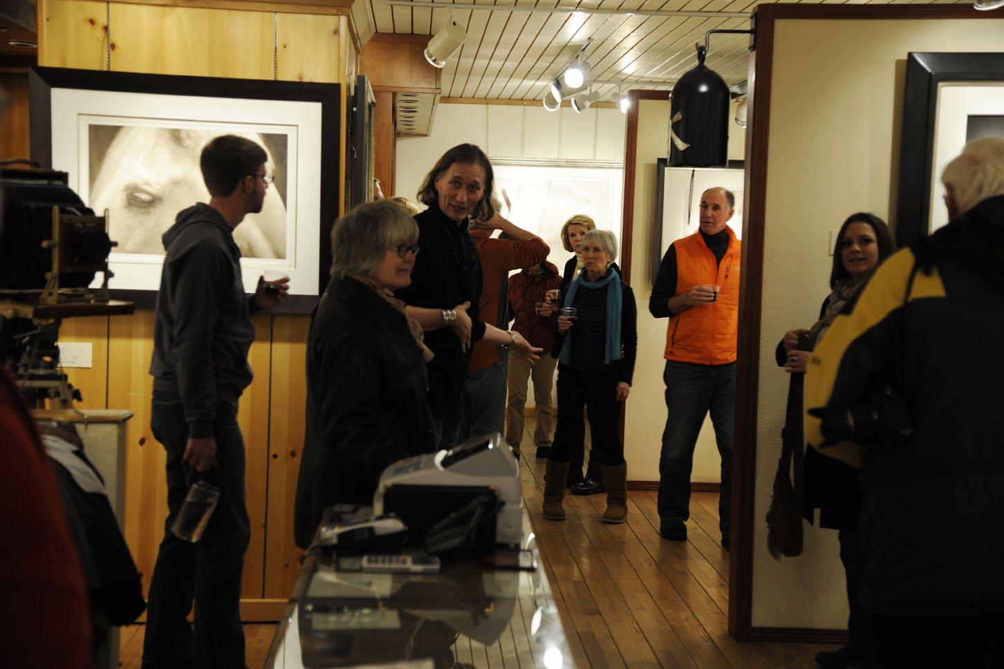
Over 40 people gathered for the photogravure talk by Jon Lybrook at Brookover Gallery in Jackson
Over 40 people gathered at the Brookover Gallery in Jackson, Wyoming this week to learn about modern techniques for producing handmade photogravure prints. Jon Lybrook of Intaglio Editions has printed nine editions for David Brookover so far with more scheduled for release in the summer. This spring David is going on an excursion to Iceland and Europe for over two months to travel and capture more amazing images of the natural world.
 David has been photographing the great outdoors for over 40 years gaining an international reputation for technical and artistic excellence as a large format photographer using an 8×10″ view camera. In recent years, he has moved to digital and has begun publishing his prints as photogravures on handmade Japanese gampi as well as heavier western papers from Italy and Germany.

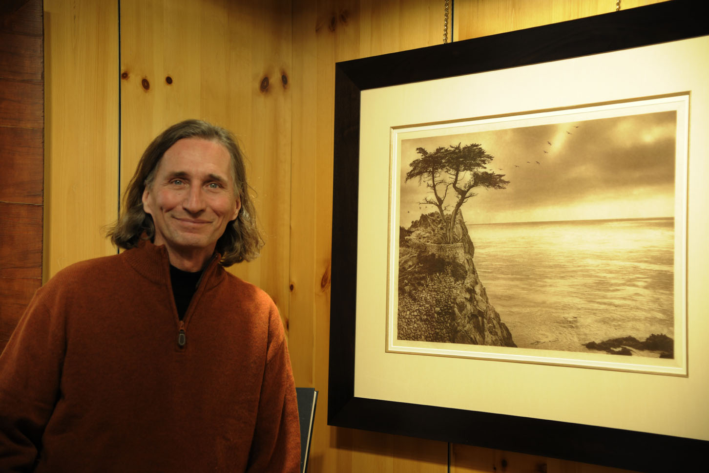
Printmaker Jon Lybrook and Photographer David Brookover – February 17, 2014
Historically the collaboration between photogravure artists and the printmaker has been based on a tremendous amount of trust and goodwill. The artist must trust that the printmaker will make the correct technical decisions and the printmaker must trust the artist will make the best aesthetic decisions. The lines between what is technical and what is aesthetic are often blurred and so, sometimes the roles of artist and technician are reversed.
The talk was sponsored by the Teton Photography Group of Jackson and covered a brief technical explanation of the polymer photogravure plate and printmaking process followed by a show-and-tell of materials, papers, and techniques for printmaking. Examples of chine colle, the technique of applying fine, colored papers onto a handmade print were shown as well as descriptions of how a typical intaglio plate is inked and printed on a press using dampened, fine art paper. Jon Lybrook also showed examples of his own printed work, both photographic and non-figurative and those of other photogravure artists he has worked with.
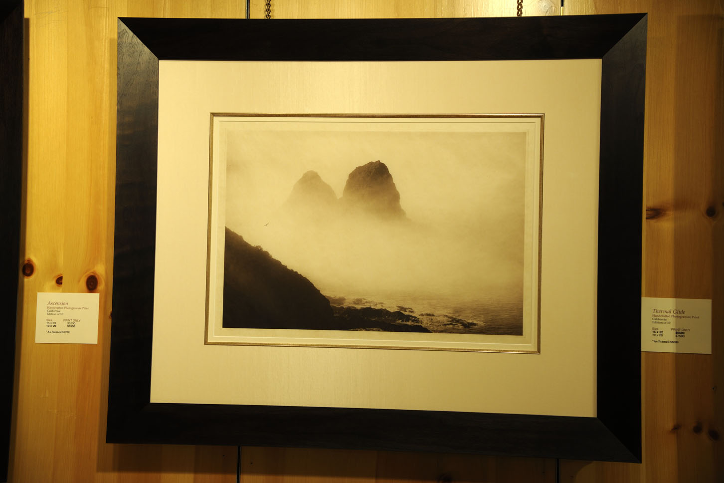
Thermal Glide (2014) by David Brookover printed on handmade Japanese Gampi paper

Gampi and Kozo, shown here in their raw forms are extremely tough fiber from which some of the best handmade asian papers are made.
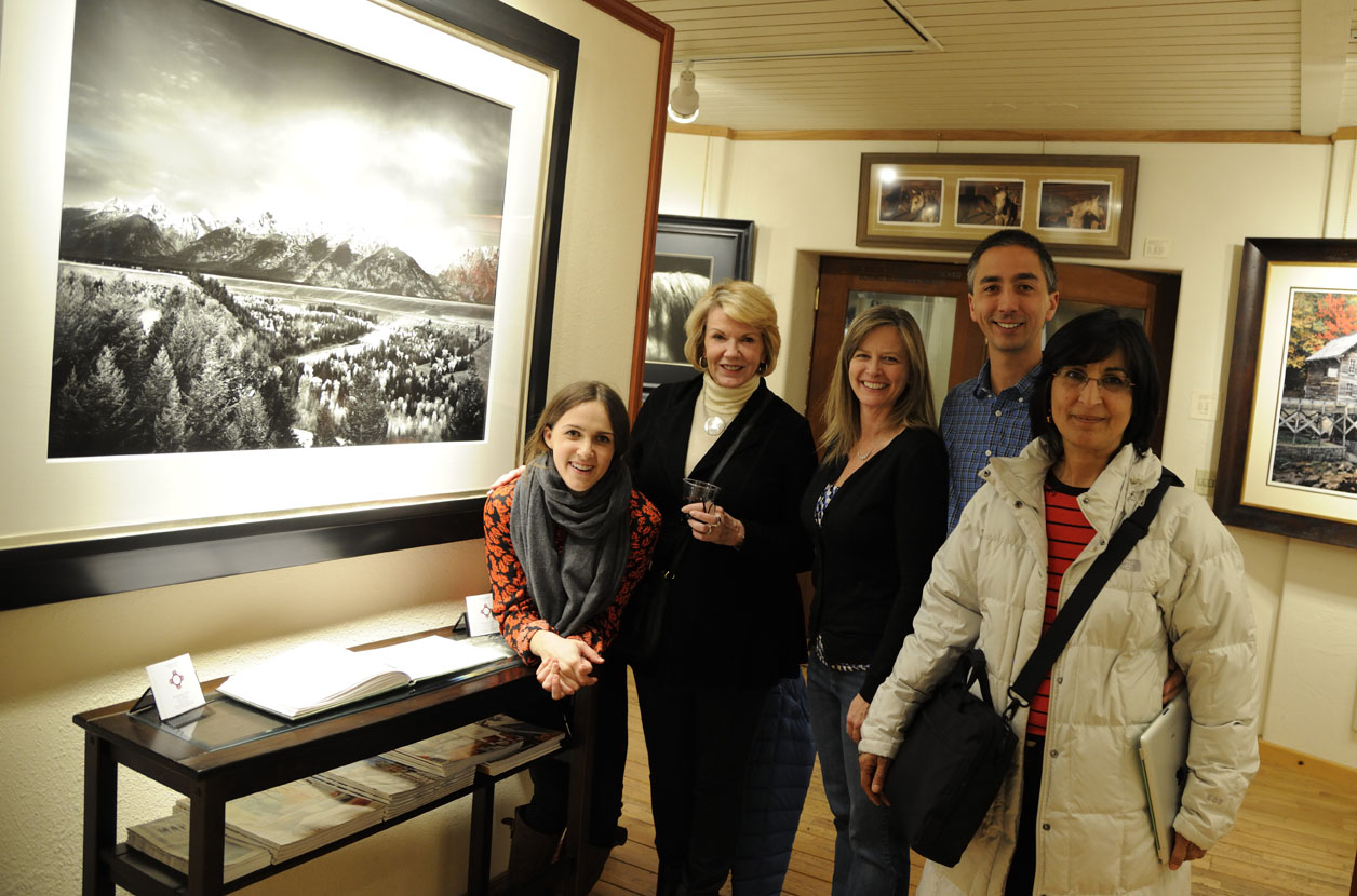
David’s Gallery Assistant Katherine Cronin (far left) and other hard-core art and photography enthusiasts from the Teton Photography Group remain after the talk – February 17, 2014.
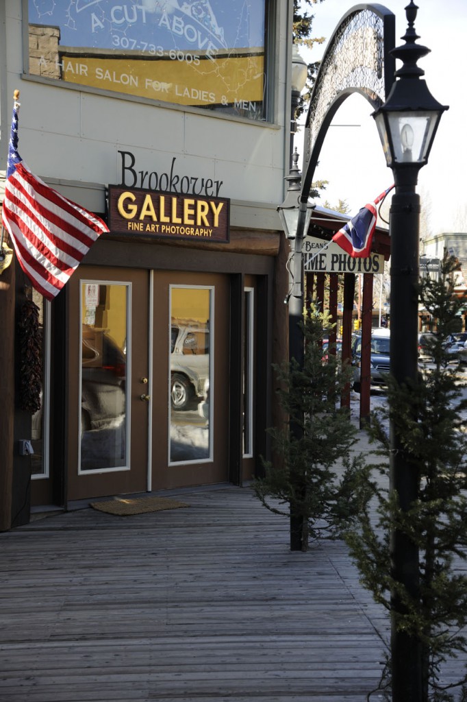
The Brookover Gallery in Jackson Wyoming is located at 125 North Cache Street, Jackson Wyoming and may be reached at 307-732-3988. Call for hours and directions.

Coupole du Val de Grace – Paris 1693 – designed by Pierre Mignard – Engraved and Published by Audran Girard
The International File Print Dealers Association (IFPDA) is an annual print fair of epic quality and scale held in New York City every year. Fine, printed work from every era, traditional technique, and genre is represented by around 100 exhibitors, and includes artists and printmakers as varied as Albrecht Durer, Rembrandt, Picasso, Damien Hurst, Robert Mangold, Chuck Close, Ed Ruscha, Robert Rauchenberg, and Judith Rothchild. In additfion, many different types of printmaking and sculptural prints are made available including multiple-plate, traditional etchings, photogravure, polymer photogravure, mezzotint, monotype, monoprints, linocut, woodblock, lithographs, screen printing, and mixed media — to name just a few.
This print fair has a level of quality which often surpasses that of the large museums, as private curators and collectors will sometimes have higher standards (and budgets) than those of prestigious museums. Since many of the vintage works in a museum come from bequests from private collectors, the work donated might not be optimally cared for throughout the decades or centuries. As it concerns contemporary prints, I suspect the quality is better too because museums sometimes get their acquisitions at a discount or even pro-bono in exchange for the exposure and bragging rights an artist gets for having their work in the collection of a major institution.
Some of the highlights of the four-day show, which ran from November 7-10, 2013, included seeing contemporary lithographs by Shark’s Ink in Lyons, Colorado. Bud Shark was one of a handful of printmakers on-hand to answer questions about the process and the artists he represents.
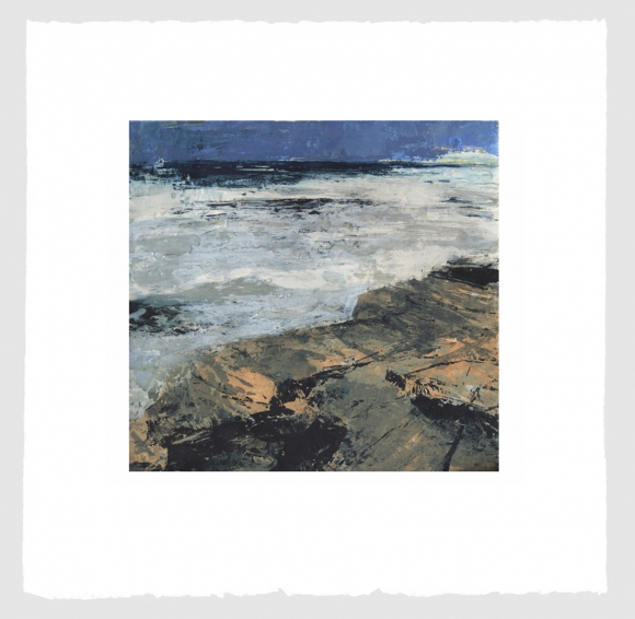
Untitled III, 2013 by Donald Teskey
Carborundum & intaglio, sheet 69 x 69cm
Edition of 75
The work of painter Donald Teskey was skillfully printed by Stoney Road Press based in Dublin, Ireland. The line art was rendered with a polymer plate charged with black ink on top of several chunky, coarse, carborundum plates to present impressionistic seascapes. Looking almost like acrylic paintings, the plates revealed the different layers of thick ink that went into each print, and the guys from Stony Road even offered to point out the slight differences among prints in the edition.
Other work of interest included luscious, technically superior, 4-color polymer photogravures of mushrooms by Niels Borch Jensen Editions out of Copenhagen showed a strong command of the process by achieving smooth, continuous tone, color, and registration in their prints.
Pace Prints of New York demonstrated their expertise and versatility through the clean etchings, dignified colored shapes with embossment and thoughtful spirals in prints by Robert Mangold as well as larger more ambitious works by brothers How & Nosm (Raoul and Davide Perre).
Crown Point Press had a number of fine printmaking techniques on display, including artist Shahzia Sikander who, in using Indian ink and multiple plates created artful and skillful figurative compositions including a “secret” language of glyphs. Crown Point’s Tiffany Harker did not hesitate in answering academic questions regarding editioning and numbering practices and was both patient and professional.
A generous assortment of high-quality, reasonably priced mezzotints, photogravure, and vintage works were being shown immaculately by Corad R. Graeber Fine Art of Maryland.
Probably the most satisfying and masterful contemporary work printed in a traditional manner were square, copper photogravure prints by Chuck Close which illustrated the mastery of printmakers of Two Hands of NY.
In terms of rich, sensual, creative approaches to traditional techniques, the large, non-figurative prints of Japanese artist Tamekane Yoshikatsu by Tolman Gallery of Tokyo were certainly among the most dynamic and colorful available at the fair. Tasteful design juxtapositions of chine colle, ink and generous embellishments of gold leaf in the artist’s work made for a multi-layered feast of the senses. I have decided to give my own, personal “Best of Show” to this artist.

Tamekane Yoshikatsu’s Melancholic Moon – 2012
In addition to the wonderful array of exhibitors and artists work on hand, several talks and tours were a part of the fair — including an insightful talk with David Acton, the Curator of Prints, Drawings and Photography at the Worcester Art Museum.
DXKPYKCNMF6A