
Coupole du Val de Grace – Paris 1693 – designed by Pierre Mignard – Engraved and Published by Audran Girard
The International File Print Dealers Association (IFPDA) is an annual print fair of epic quality and scale held in New York City every year. Fine, printed work from every era, traditional technique, and genre is represented by around 100 exhibitors, and includes artists and printmakers as varied as Albrecht Durer, Rembrandt, Picasso, Damien Hurst, Robert Mangold, Chuck Close, Ed Ruscha, Robert Rauchenberg, and Judith Rothchild. In additfion, many different types of printmaking and sculptural prints are made available including multiple-plate, traditional etchings, photogravure, polymer photogravure, mezzotint, monotype, monoprints, linocut, woodblock, lithographs, screen printing, and mixed media — to name just a few.
This print fair has a level of quality which often surpasses that of the large museums, as private curators and collectors will sometimes have higher standards (and budgets) than those of prestigious museums. Since many of the vintage works in a museum come from bequests from private collectors, the work donated might not be optimally cared for throughout the decades or centuries. As it concerns contemporary prints, I suspect the quality is better too because museums sometimes get their acquisitions at a discount or even pro-bono in exchange for the exposure and bragging rights an artist gets for having their work in the collection of a major institution.
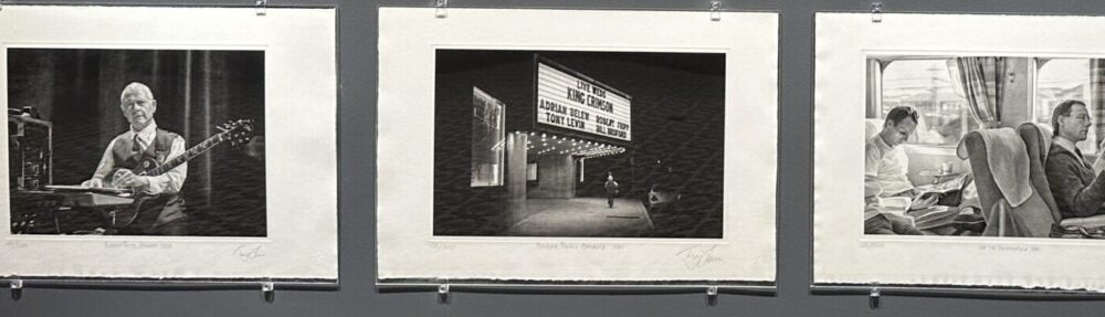
Some of the highlights of the four-day show, which ran from November 7-10, 2013, included seeing contemporary lithographs by Shark’s Ink in Lyons, Colorado. Bud Shark was one of a handful of printmakers on-hand to answer questions about the process and the artists he represents.
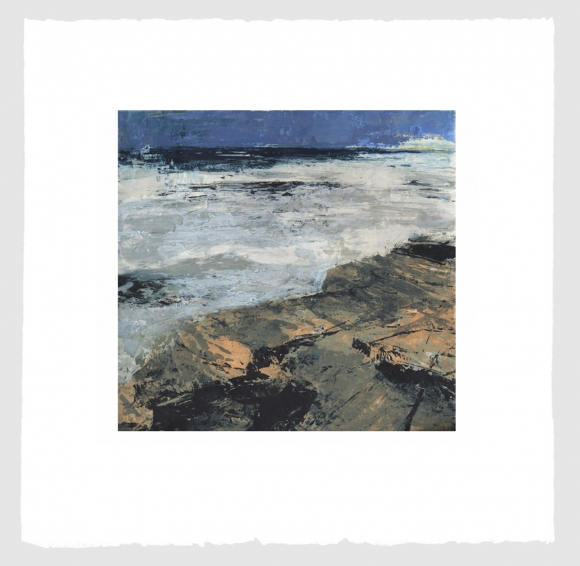
Untitled III, 2013 by Donald Teskey
Carborundum & intaglio, sheet 69 x 69cm
Edition of 75
The work of painter Donald Teskey was skillfully printed by Stoney Road Press based in Dublin, Ireland. The line art was rendered with a polymer plate charged with black ink on top of several chunky, coarse, carborundum plates to present impressionistic seascapes. Looking almost like acrylic paintings, the plates revealed the different layers of thick ink that went into each print, and the guys from Stony Road even offered to point out the slight differences among prints in the edition.
Other work of interest included luscious, technically superior, 4-color polymer photogravures of mushrooms by Niels Borch Jensen Editions out of Copenhagen showed a strong command of the process by achieving smooth, continuous tone, color, and registration in their prints.
Pace Prints of New York demonstrated their expertise and versatility through the clean etchings, dignified colored shapes with embossment and thoughtful spirals in prints by Robert Mangold as well as larger more ambitious works by brothers How & Nosm (Raoul and Davide Perre).
Crown Point Press had a number of fine printmaking techniques on display, including artist Shahzia Sikander who, in using Indian ink and multiple plates created artful and skillful figurative compositions including a “secret” language of glyphs. Crown Point’s Tiffany Harker did not hesitate in answering academic questions regarding editioning and numbering practices and was both patient and professional.
A generous assortment of high-quality, reasonably priced mezzotints, photogravure, and vintage works were being shown immaculately by Corad R. Graeber Fine Art of Maryland.
Probably the most satisfying and masterful contemporary work printed in a traditional manner were square, copper photogravure prints by Chuck Close which illustrated the mastery of printmakers of Two Hands of NY.
In terms of rich, sensual, creative approaches to traditional techniques, the large, non-figurative prints of Japanese artist Tamekane Yoshikatsu by Tolman Gallery of Tokyo were certainly among the most dynamic and colorful available at the fair. Tasteful design juxtapositions of chine colle, ink and generous embellishments of gold leaf in the artist’s work made for a multi-layered feast of the senses. I have decided to give my own, personal “Best of Show” to this artist.

Tamekane Yoshikatsu’s Melancholic Moon – 2012
In addition to the wonderful array of exhibitors and artists work on hand, several talks and tours were a part of the fair — including an insightful talk with David Acton, the Curator of Prints, Drawings and Photography at the Worcester Art Museum.
DXKPYKCNMF6A